Good Hands
Brand Identity & Portfolio
2023
The overall look and feel of the identity is bright, clear, modern and hip balancing the organic and the technical.
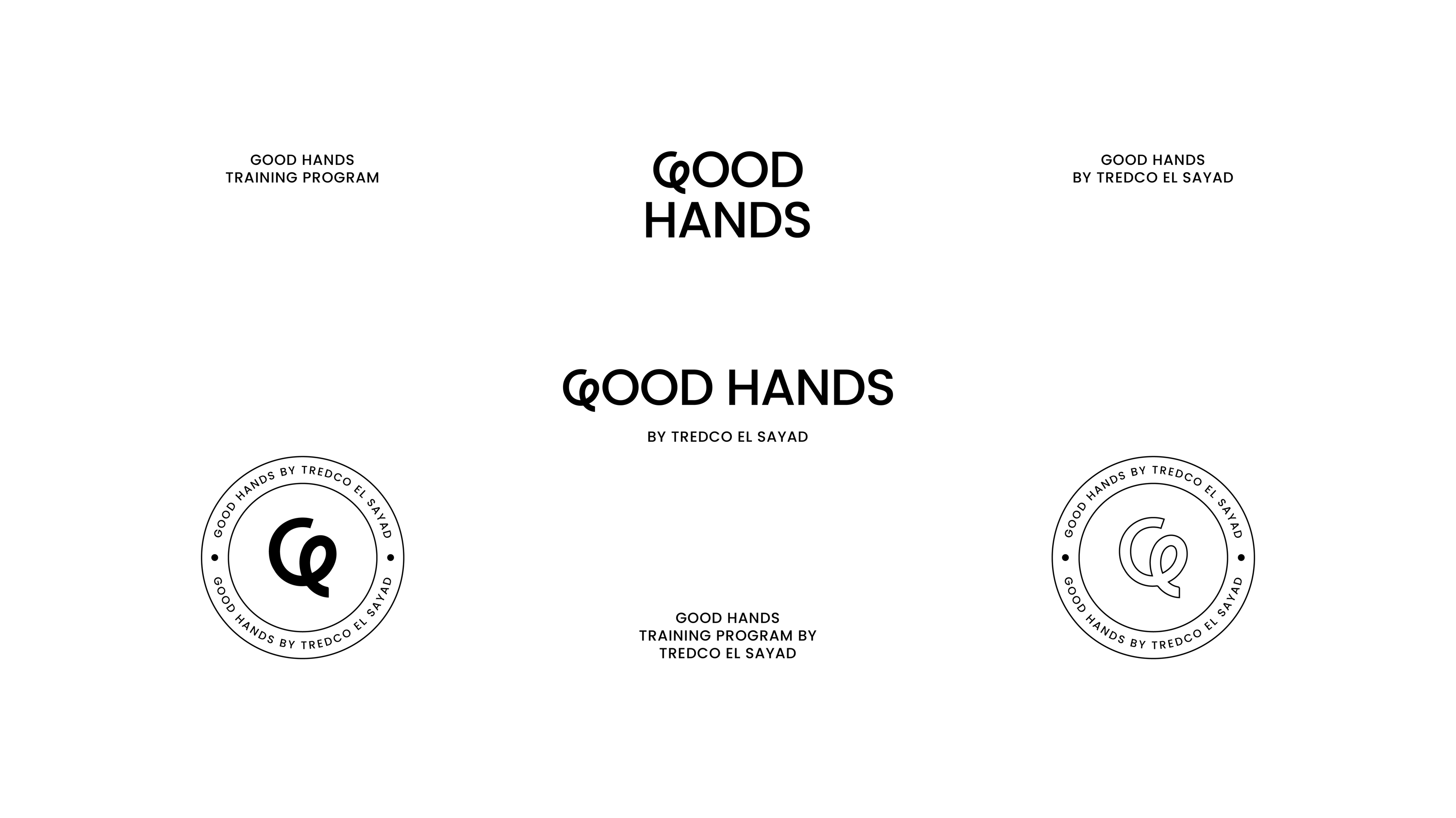
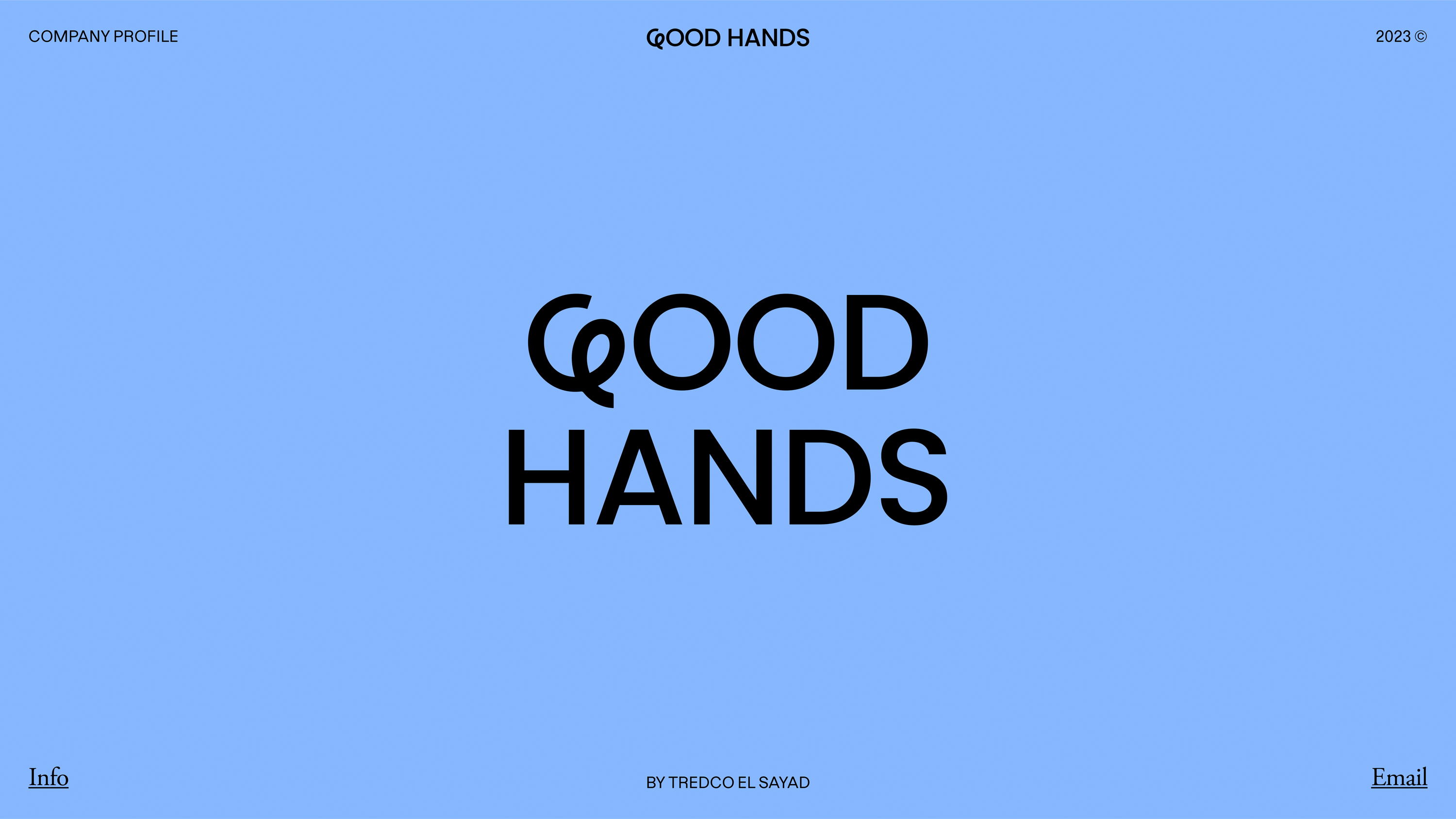
The Good Hands identity centers on a bespoke and expressive hand drawn “G” symbol with a distinctive loop symbolizing a thread. Understated yet distinctive, the aim was for it to be a strong and confident sign off for the ever-growing brand. The humanist details aim to reflect the brand’s forward-thinking values and its people-centred approach.
The customized “G” provides a link from Good Hands to the services it provides, and is designed to work at any scale, to be reproduced on any substrate, and to provide the basis for an expanding family of materials.
Our typeface is rich in character, but equally precise and trustworthy, echoing the vision of the brand and its ability to scale up with confidence.